Use of Particulate Source Apportionment Modeling to Identify Most Impaired Visibility Days in IMPROVE Monitoring Data
Posted: 14 Feb., 2017
Last update: none
ABSTRACT
Comprehensive Air-quality Model with extensions (CAMx) Particulate Source Apportionment Technology (PSAT) modeling results for 2008 and 2011 were used to define which components of IMPROVE measured particulate matter (PM) were due to U.S. anthropogenic versus uncontrollable sources. Uncontrollable sources included biogenic, lightning NOx, sea salt, and open land fires (wildfires, prescribed burns and agricultural burning). The IMPROVE measured visibility impairment at Class I areas was then analyzed to determine the days and amount of visibility impairment for the most impaired days, defined as the 20% days with the highest visibility impairment due to anthropogenic emission(1) as proposed in the draft Technical Support Document and Data File from OAQPS from June 30, 2016(2). The development of the PSAT-derived most impaired days IMPROVE(3) spreadsheets for 2008 and 2011 are described along with example displays and how to download the results.INTRODUCTION
The Regional Haze Rule objective is to achieve natural visibility conditions(4) at Class I areas by 2064. This is accomplished through a series of SIP actions by the individual states hosting for their one or more Class I areas, to achieve reasonable progress toward an individual Class I area’s milestones in 2018, 2028, et cetera, as selected by the individual state. The SIPs show progress toward natural conditions by reducing visibility impairment on the most impaired days and showing no degradation in visibility on the cleanest visibility days. The first round of visibility SIPs, originally due in 2007, were required to demonstrate the first round of progress toward natural conditions through 2018. The worst 20% visibility days (W20%, the top quintile of the individual days with the greatest total impairment from all species sampled by each IMPROVE sampler) at IMPROVE monitoring sites during 2000-2004 have been used as the most impaired days metric for demonstrating progress until the proposal in mid-2016 re-defining the metric. However, at numerous Class I areas, the W20% days were dominated by visibility impairment due to wildfires and/or windblown dust events that are natural uncontrollable sources.In June 2016, EPA proposed a revised regional haze most impaired days metric that uses a statistical approach to try to eliminate days with large fires (through organic carbon contribution) and windblown dust events (through crustal contribution) from the most impaired days metric. Although the new EPA most impaired days metric greatly reduced the occurrence of visibility days dominated by fires/dust, for Class I areas with very large and/or persistent fire impacts there were still days in the EPA most impaired days metric influenced by wildfires and for Class I areas with few fire impacts the technique can potentially remove days with high anthropogenic organic carbon contributions from the EPA most impaired days metric. The use of a single statistical technique to eliminate fire/dust impacts from the most impaired days metric across all Class I areas fails to account for unique aspects of IMPROVE monitoring sites allowing natural sources to leak into the most impaired days metric and/or anthropogenic contributions to not be included in the metric.
An alternative approach to EPA’s proposed most impaired days metric was developed that uses particulate source apportionment technology (PSAT) modeling to define the PSAT most impaired visibility days due to just anthropogenic U.S. emissions at IMPROVE monitoring sites.
METHODOLOGY
CAMx PSAT modeling results for 2008 and 2011 were used to estimate which components of measured IMPROVE particulate matter (PM) and visibility extinction were due to U.S. anthropogenic versus uncontrollable sources at IMPROVE monitoring sites. The CAMx PSAT modeling results for 2008 were from the West-wide Jump-Start Air Quality Modeling Study (WestJumpAQMS), and the 2011 PSAT results were from the Western Air Quality Study (WAQS) whose results are available on the Intermountain West Data Warehouse (IWDW). Below we describe the WestJumpAQMS and WAQS CAMx PSAT source apportionment modeling approach used to apportion IMPROVE visibility data between U.S. anthropogenic and uncontrollable sources, more details on the design and configuration of the source apportionment modeling are contained in the description of the WAQS Round 1 SA: Geographic Region Source Apportionment Modeling on the IWDW website.PSAT Source Apportionment Modeling Approach
The PSAT source apportionment modeling was performed on a continental U.S. (CONUS) and western U.S. domains using 36 and 12 km grid cell resolution, respectively. Separate PM contributions were obtained for 21 geographic Source Regions that consisted of 17 western states, eastern U.S., portions of Mexico and Canada and offshore (shown below). Source contributions were also obtained for 5 different Source Categories as follows:- ANT = Anthropogenic Emissions
- NAT = Natural Emissions (biogenic VOC and NOx, lighting NOx; sea salt and windblown dust PM)
- WF = Wildfires
- Rx = Prescribed fires
- AG = Agricultural fires
Source contributions were also obtained for Initial Concentrations (IC) and Boundary Conditions (BC). The BCs around the CONUS domain were obtained from the MOZART global chemistry model. With 21 Source Regions, 5 Source Categories and IC/BC, source contributions were obtained for 107 separate Source Groups (107 = 21 x 5 + 2).
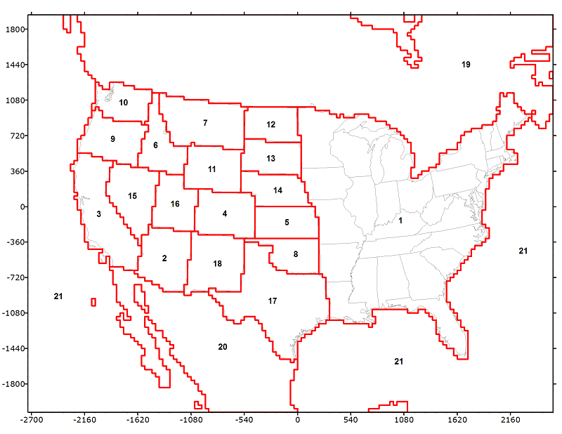
For the visibility analysis, source regions were combined into U.S. (source regions 1-18) and non U.S. (source regions 19-21), and source sectors were combined to obtain Anthropogenic (ANT) and Uncontrollable (source categories NAT, WF, Rx and Ag) sources. The visibility analysis also assumed Mexico, Canada and offshore anthropogenic emissions were Uncontrollable.
Download Visibility Modeling Results and Interactive Spreadsheets
Below we describe how to use the interactive Excel visibility spreadsheets. Results from these spreadsheets were used in three PowerPoint presentations that were presented at the September 27-30, 2016 A&WMA Visibility Conference in Jackson Hole, Wyoming:- A Conceptual Approach to Address Anthropogenic/Non-Anthropogenic Emission Sources to Help Develop More Accurate Regional Haze Program Glidepath C55_Nopmongcol_AWMA_vis_Sep2016.pptx
- Assessment of the Contributions to Visibility Impairment in the Western U.S. and Effects of New Guidance for Tracking Progress RMorris_WRAP_AWMA_Vis_n42_2016-09-29v3.pptx
- Evaluation of Revised Uniform Rate of Progress Goals for the Western United States RMorris_WRAP_AWMA_Vis_n116_2016-09-28v4.pptx
To use the interactive Excel visibility spreadsheets for 2008 and 2011 IMPROVE monitoring sites, you need to download the spreadsheets and the CAMx modeled visibility data. The CAMx modeled visibility data has separate files for each IMPROVE site that are downloaded in a zipped file and should be extracted into a user-selected folder. These data are obtained from the following links:
- 2011 Visibility Spreadsheet WAQS2011_VIS_macro_v1.xlsm
- 2011 CAMx modeled Visibility Data ftp://viking.cira.colostate.edu/pub/SourceApportionment/Particulates_v6/final_wsaq2011_CAMx_PSAT_Improve.zip
- 2008 Visibility Spreadsheet WestJump2008_VIS_macro_v1.xlsm
- 2008 CAMx modeled Visibility Data ftp://viking.cira.colostate.edu/pub/SourceApportionment/Particulates_v6/final_WJ2008_CAMX_PSAT_Improve.zip
Description of Interactive Excel Visibility Spreadsheets
Interactive spreadsheets were developed that create numerous visibility plots for a user-selected IMPROVE site. Prior to using the spreadsheet, CAMx modeled visibility data must be downloaded and the “Data Path” must be defined (Cell B1 in tab “select_site”) to point to the folder containing the downloaded CAMx modeled visibility data. Once the “Data Path” is defined in Cell B1, the user selects a “Site” from the drop down list in Cell B2 and visibility plots are generated for the selected site. The example below shows that the Yellowstone Class I area IMPROVE site data was selected.
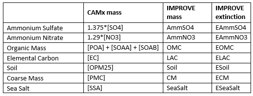
Visibility plots are generated for total visibilty and individual visibility impairing species. The list of visibilty species with abbreviations is given in the table below.
There are 4 tabs with visibility plots in the interactive spreadsheets:
1) Tab = “ModelAssessmentPlots”: Plots compare CAMx modeled and IMPROVE Extinction for individual visibility species on days during 2008 or 2011 with IMPROVE measurements, as shown in the example below for Ammonium Sulfate at Yellowstone National Park (YELL2) for 2011.

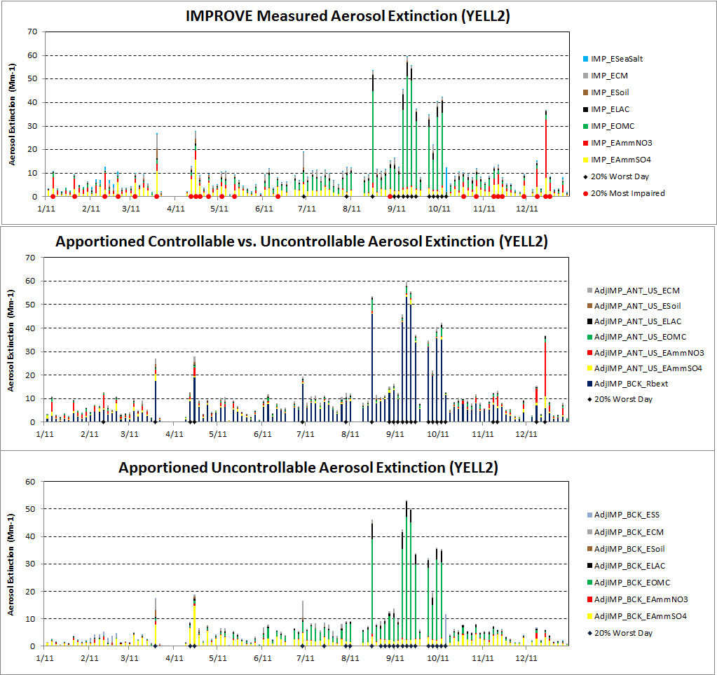
2) Tab = “Anthro_Plots”: The “Anthro_Plots” tab contains several different types of plots, as shown below:
a) IMPROVE extinction for the selected site. The black dots on the bottom axis indicate days that were included in the old EPA W20% days metric with the red dots being days included in EPA’s new 20% most impaired days metric (note that the red dots can cover up the black dots when there are common days)..

b) Adjusted IMPROVE U.S. anthropogenic extinction (based on scaling by CAMx PSAT (Anthropogenic/Total) ratio). The black dots at the bottom represent the worst 20% days for data in plot, which in this case are the PSAT most impaired days metric.

3) Adjusted IMPROVE Uncontrollable (“Background”) extinction (based on scaling by CAMx PSAT (Uncontrollable/Total) ratio). The black dots at bottom represent worst 20% days for the data in these figures.

a) Modeled aerosol extinction

b) Modeled anthropogenic U.S. aerosol extinction

c) Pie charts reporting average species contributions to extinction for IMPROVE and modeled data
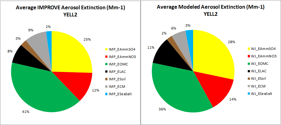
d) Additional pie charts for individual species reporting source region and source sector contributions (see spreadsheet)
e) Additional nitrate and sulfate time series plots


4) Tab = “Background_Plots”: A set of time series plots that investigate the composition of uncontrollable background contributions to extinction both modeled and from IMPROVE data
5) Tab = “W20Plots”: For the selected sites the plots include:
a) New EPA most impaired days method applied to IMPROVE data, natural speciated and anthropogenic contributions to extinction on 20% EPA most impaired days

b) CAMx PSAT model data used to apportion IMPROVE data into background (uncontrollable) speciated and anthropogenic contributions to extinction on most impaired days.

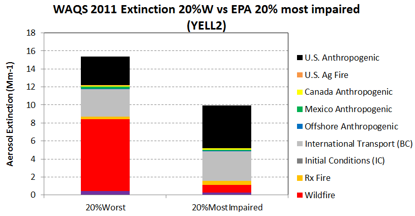
c) Plots similar to a) and b) that focus on anthropogenic speciated contributions to extinction d) Plot comparing average 2011 WAQS CAMx PSAT modeled extinction for: (1) W20% days (original set of days) with (2) 20% most Impaired days, which shows effect of EPA adjustment to IMPROVE data. Note (1) has larger total extinction but smaller U.S. Anthropogenic component compared to (2).
____________________________________________________________
1. In reality, the highest concentration days for sulfate and nitrate on the IMPROVE filters collected at monitoring sites tracking regional haze at the Class I areas, see next footnote for technical references from EPA OAQPS.
2. Draft Guidance for the Second Implementation Period of the Regional Haze Rule (https://www.epa.gov/visibility/draft-guidance-second-implementation-period-regional-haze-rule, accessed Feb. 14, 2017). This draft guidance document was prepared by the EPA to assist states in developing and submitting regional haze State Implementation Plans for the second implementation period (2018-2028). This document is currently in draft form, and the EPA plans to finalize the guidance after the public comment period. The availability of this draft guidance and the details of the public comment period are announced in the Notice of Availability. A summary of the purpose and content of the document is given in the fact sheet.
• Notice of Public Informational Webinar on the Draft Guidance for the Second Implementation Period of the Regional Haze Rule
• Regional Haze Guidance Technical Support Document and Data File
• Notice of Availability of Draft Guidance on Regional Haze (81 FR 44608)
• Draft Guidance for the Second Implementation Period of the Regional Haze Rule (PDF)(248 pp, 3 MB)
• Fact Sheet for Draft Regional Haze Guidance (PDF)(3 pp, 128 K)
3. Interagency Monitoring of PROtected Visual Environments (IMPROVE) program (http://vista.cira.colostate.edu/improve/,http://vista.cira.colostate.edu/Improve , accessed Feb. 14, 2017).
4. For Regional Haze planning purposes, Natural Visibility Conditions are defined as the absence of perceptible impairment from anthropogenic sources. They are discussed in the Regional Haze Rule promulgation of Dec. 14, 2016 (https://www.gpo.gov/fdsys/pkg/FR-2017-01-10/pdf/2017-00268.pdf). They do not have a measurable quantity but can be estimated with air quality models.